... in which we see what our hero makes seeable.
Visualization?! WTF?
Since first getting involved in bioinformatics I became interested in ways to produce images from data. Inside these vast amounts of numbers hide correlations, connections, patterns, dependencies, structures, whole worlds waiting to be discovered and brought to the surface. Statistical methods are still the way to go to produce reliable and reproducible results, but their application requires prior assumptions and expectations about the underlying structures. Furthermore, they are not easily communicable on their own. Graphing results of statistical analysis has long been a much-researched discipline on its own. Plotting collected data on cholera outbreaks on maps, for example, has identified infected wells since the 17th century.
Moving away from classic bar graphs and x/y plots in dull colors, a new world of the beauty of data opens up. Tickling the numbers until they reveal fascinating and pleasing structures, colors and shapes is not only aesthetically gratifying, it can also help to understand the data. What's more, it induces people to play with the data and on the way, new knowledge about it is generated. Open Data initiatives all over the world use the inherent playfulness and fascination with beautiful images of people to that purpose.
My own interest in the topic began with simple experiments with particle diffusion systems, where dots moving randomly over the screen left traces and ultimately 2D-histograms or heatmaps of probabilites of finding a particle in a region. An initial fascination for those beautiful random images got me interested in stochastic simulations. It would have never worked the other way round. cf. also the dancing molecules, which (I hope) will also induce people to play and learn something about vectors and complex systems without knowing it.
Walking up the valley of visualization, one soon encounters the alps of Algorithmic Art, where strange people on the boundaries between mathematics, computer graphics and mental institutions use mathematical equations, stochastic simulations, random noise, conscious and random user interactions, everything that generates or crunches numbers to create images, music, animations, sculptures, real buildings.
Scientific visualization
Some examples of images I have produced, mostly side products of researchy stuff I've been doing. Some programs are interactive, but there is no web version yet. If you are interested in source code, I might be able to provide it. But do not expect any comments or nice clean modular code. Most of this stuff was hacked up between coffee breaks (which are not far apart in my case) as helpers on the way while I do my real work, both as a distraction and getting quick overviews over intermediate results.
GO annotations
Explain.
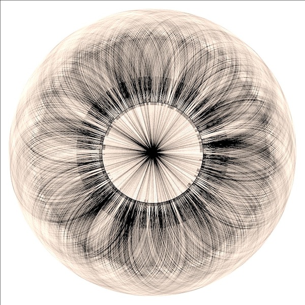
Mycoplasma genitalium chromosome shown with predicted open reading frames (genes). For each ORF, a homology search (tblastx) was done in the UniProtKB protein database. For the best 50 hits, GO terms were retrieved. If two genes have homologs with the same GO term, they are connected with a line. Genes are shown as thick lines on the circle (chromosome), inwards and outwards for sense and anti-sense strand respectively.
Really doesn't show anything useful, but looks beautiful (to me). GO (gene ontology) is a controlled vocabulary that is used to annotate genes with terms describing function, localization, regulation etc. So, if two genes share GO terms, they have something in common. So at least you could say it shows that no gene stands alone. There is potential, though. An interactive version of that graph could filter by GO term categories (showing, for example, only amino acid biosynthesis genes) or let the user select single genes and track their relationships. More information could be packed into the graph by relating line thickness to e-Values of homolog scores or other statistical measures.
The data was generated during the preparation of a systems biology course, were students have to do a simplified metabolic reconstruction from the M. genitalium genome sequence. I managed to put a little visualization in there by letting them produce hierarchical graphs of Gene-Protein-Reaction relationships and metabolic network layouts.
Using R and Perl for data analysis, Processing for visualization.
KEGG Module Database
Explain.
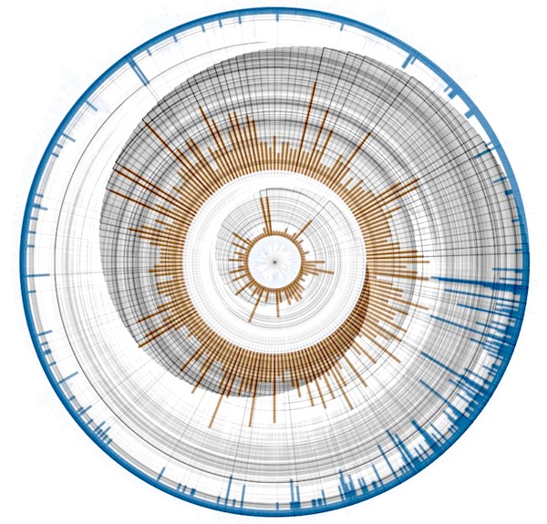
The KEGG Module database (https://www.genome.jp/kegg/module.html) consists of functional subunits of metabolic pathways. They might be shared and reused in different pathways and describe a particular metabolic activity or pattern. This graph relates pathways (nodes arranged on the innermost circle) to modules (middle circle) to enzymes (outer circle), which form a hierarchy: An enzyme can take part in different modules, which might be part of different pathways. Lines between the circles represent this relationship. The lines are drawn outwards, go clockwise around the circle and then outwards to the connected node. Radius lengths based on the positions of the connected nodes produce the spiral shape. The bars for each node show the out- (blue) and in-degree (orange), i.e. the number of modules this pathway is made out of, the number of enzymes making up that module and the number of modules an enzyme takes part in.
Again, not very useful, but strangely beautiful. This is more of a concept study for the visualization of hierarchical graphs where there is a lot of branching at the lower levels. Circular visualization has the natural advantage that the outer circles provide more and more space for nodes. Edge crossing minimization will help to untangle the connecting lines and produce clearer graphs. Of course, an interactive versions can be very useful by providing means to rotate circles, highlight nodes and their connections and switch between different bar chart data sources.
Using Perl for data analysis, Processing for visualization
Enzyme clustering
Explain.
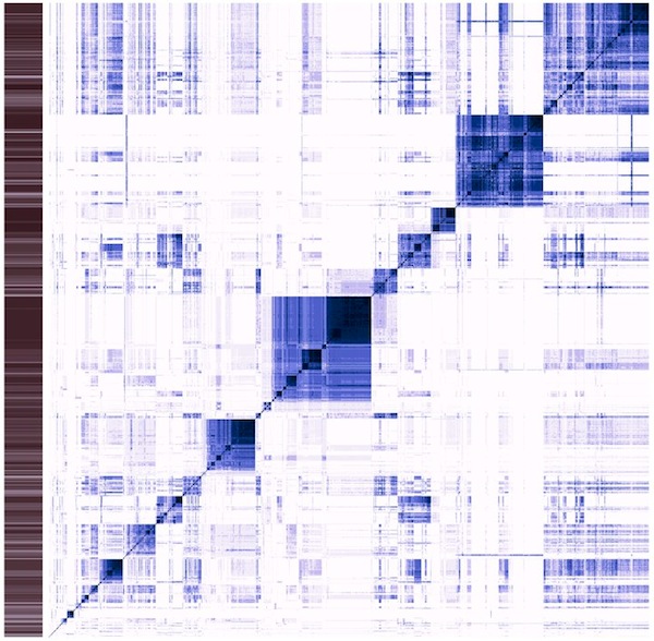
Classic heatmap visualization of the enzyme reaction mechanism clustering project I am working on (see Science things#Enzyme clustering for details). This visualizes a distance matrix of all the tested enzymes. So, on the x axis, each column is an enzyme, and on the y axis each row. Each line corresponds to a comparison of the enzyme in that line with all the other enzymes. The diagonal of this square compares the enzyme with itself. The more similar two enzymes are, the darker the dot.
This is the result of an hierarchical clustering algorithm. Darker areas along the diagonal are groups of similar enzymes. Sometimes, these groups are contained within larger groups. Some groups are quite similar to others (darker areas off the diagonal). The sidebar contains information about the average similarity of the enzyme in that line with all the others. This graph is not easy to read, but provides a wealth of information once understood. I use it to judge the quality of clusters, (how homogeneous is it?) as well as possible merges of two or more clusters (how similar are the enzymes within that cluster to other clusters?).
Using R for data analysis and visualization
Sequence alignments
Explain.
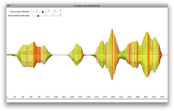
Old project: Visualizing multiple sequence alignments (MSA) of protein sequences, frequently used in homology research. Each sequence of the alignment is a horizontal line. Based on conservation at each position of the sequences (bit-score), the line deviates along the y-axis. So regions with high similarity are wider than others (conserved regions like protein domains). Various amino acid properties can be used to color the alignment, in this picture it is hydrophobicity. This shows transmembrane domains quite nicely in uniformely orange regions, for example. All values are calculated as moving averages to smooth things. The window size can be configured interactively.
Classic tools for working with MSAs (e.g. JalView) are always letter/position oriented, which might be useful in most cases. There are, however, not a lot of tools for showing a quick overview of regions with high conservation and their properties (like hydrophobicity). Various amino acid descriptors can be used to color regions. This is not only useful for the initial analysis of MSAs, but also for talks, presentations and posters.
Visualization with Processing
Other
Not very much yet. So much to do, so little time.
Viennale '11
Explain.
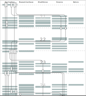
The Viennale is Vienna's largest movie festival. Each year for two weeks, there are hundreds of screenings in 5 cinemas. I wanted to track a group of movie enthusiasts chronologically throughout the festival. Each line is one person, connecting the screenings they attended. I asked them to give ratings from 1 to 10 for each movie and sized the boxes accordingly. The complete interactive version can be found here.
Price Tags for Personalities
Explain.
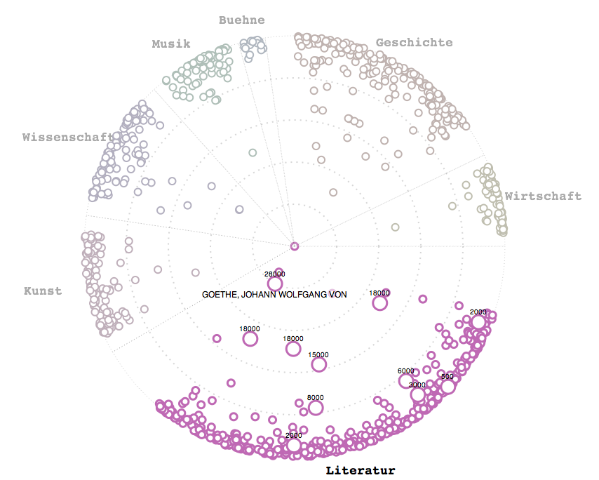
Visualization of the catalogue for an auction of about 1000 manuscripts by various influental personalities on Oct 22/23 2011. Focus is on the price and what we can say about the relative importance of the person (price tags). More information and interactive version here.
IMDb film lengths
Explain.
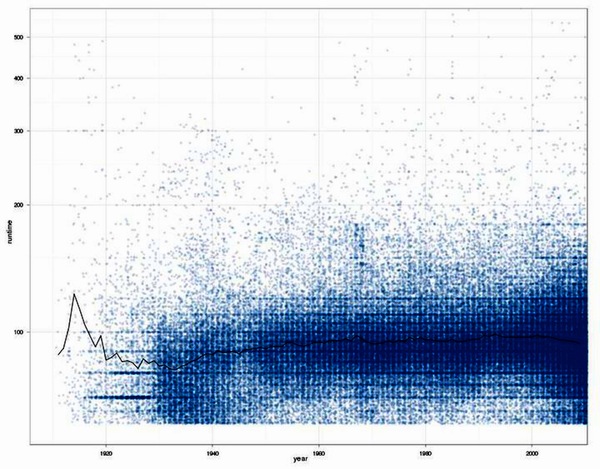
Result of a discussion about the impression of a friend that movies tend to get longer and longer.
Except for before the 1930s (where data is quite rare), there is no tendency for movies to get longer. Just the spread in runtimes gets bigger, the median runtime stays about the same. In the late 60s there is an interesting cluster of 3 hr movies.
Filtered out movies with runtimes greater than 10 hours. There is a movie called "Matrjoschka (2006)" that runs for 95 hours. Also applied a cutoff of 60 minutes for shorts, which I did not want to include in the analysis. Since the early 2000s a lot of shorts are included in the IMDb which produces a bias.
Using IMDb data about movie runtimes munged with Perl and analyzed with R (statistical software)
Explain.
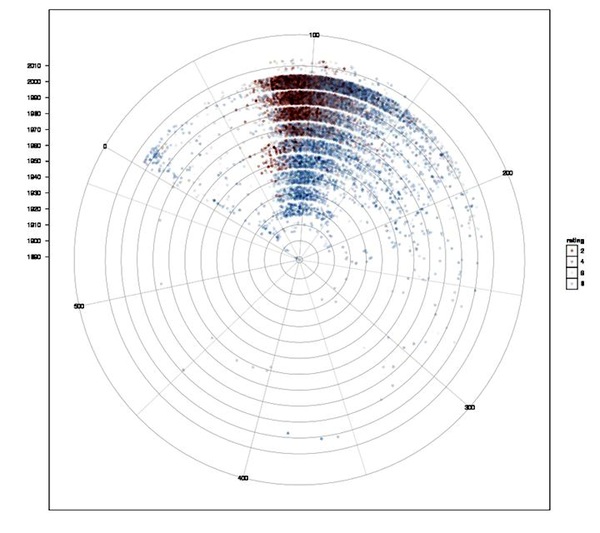
Correlation of movie runtimes and IMDb rating over the decades. Blue dots for movies with ratings above the global median (6.48 of 10), red dots for ratings below with increasing alpha values in both directions. Decades are shown in concentric circles with the 2000s in the outer circle. This is quite handy, since the number of movies increased almost exponentially and outer circles have more space to spread out.
It's interesting not only to see that longer movies tend to get better ratings, but also that there are rarely bad ratings for older movies. This is easily explained: Who watches trash movies from the 30s or 40s? Only the better ones tend to survive, while nowadays almost all movies are getting rated.
Using IMDb data about movie runtimes munged with Perl and analyzed with R (statistical software)
Explain.
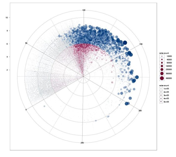
Correlation of movie runtimes and IMDb rating independent of time for all movies. Circles sized by vote count, red circles are ratings below the average (6.48 of 10), blue circles above.
Better rated movies usually have more votes. It's interesting to see that long runtime is not a necessity for receiving good ratings, but it certainly helps. Long movies with bad ratings are quite rare. It also shows the multitude of shorts entered in the IMDb, which are rarely rated at all.
Good short movies: Duck Soup, Wallace & Grommit, Toy Story. The top 300 movies have an average runtime of 122 minutes, though.
Applied a cutoff of 300 minutes length for this graph.
Using IMDb data about movie runtimes munged with Perl and analyzed with R (statistical software)
Explain.
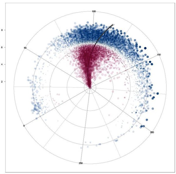
Correlation of movie runtimes and IMDb rating independent of time for movies for the 18000 movies with more than 1000 votes cast. Circles sized by their differnce to the the average (6.48 of 10) rating (because it looks cool), blue circles above that rating, red circles below. The line shows the linear regression of runtime vs. rating.
Nice umbrella shape. The few shorts with more than 1000 votes are well rated. Again, nobody rates bad shorts, it seems. Longer movies tend to get better ratings, and there is a slight correlation of runtime and ratings (when moving out to better ratings, the line shifts clockwise to longer movies).
Applied a cutoff of 300 minutes length for this graph.
Using IMDb data about movie runtimes munged with Perl and analyzed with R (statistical software)
A year full of photos
::::work in progress::::
Timeline of photos I have taken over the course of the year. Horizontal line: time, above and below rounded spaced squares colored with the dominant color of each photo. Should show: a) the varying amount of photographing I do, b) based on activities, moods, occasions, season etc. the pictures will be dominated by certain colors. Todo: Digitalize Polaroids, graph Iphone pics, etc.
Using Aperture, ImageMagick, Processing
::::work in progress::::
Movie connections
::::work in progress::::
Certain movies (not just all-star movies) have a lot of supporting actors that have gone on and played important parts in subsequent movies (Braveheart, Saving Private Ryan, Lord of the Rings, etc.). A method to show this would be to place the movie at the center of the image with lines radiating up (future) and down (past) for these actors, with circles sized by votes + ratings drawn for the movies they appear in. Also work in the position those actors appear in.
Using IMDb data, Perl, Processing
::::work in progress::::
Tour de France Infographics
::::work in progress::::
Lots of data, lots to be done. Current idea: Rise and fall of riders over two decades. Use data for the top 20 finishers (tracking 400 riders...) of each year and plot their progress over all TdFs. Might show slow starters bumbling along for a couple of years with a sudden rise, never to be at the top again (Sastre, Pereiro), brief shining shooting stars (Pantani), longtime favorites (Armstrong), eternal seconds (Ullrich), young riders bursting forth (Contador) and so on. Do similar things for sprinters, taking the green jersey contenders. Especially in this area, there seems to be a succession of eras of one sprinter dominating all others for a couple of years (Abdujaparov, Zabel, Cavendish) before being bested by the next dominator.
Using Perl, R
::::work in progress::::